How We Actually Make The Art
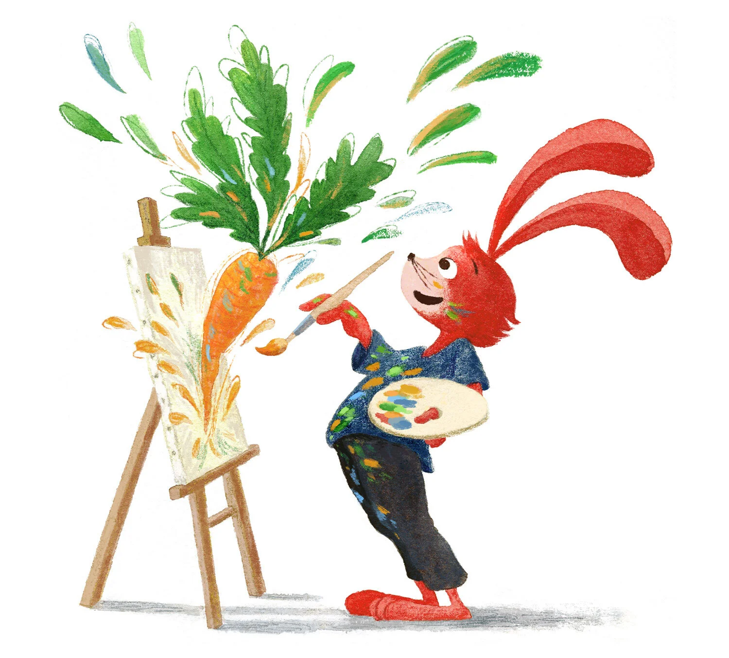
Art by Li Xin
How do you actually make an image, from idea to sketch to finished product? There’s so much that goes into making an art career take flight, sometimes we need to go back to basics and examine the nitty gritty details of making an image. Do you have a process? Do you plan? What steps do you need to take to deliver quality work? Jake Parker, Lee White, and Will Terry discuss the various methods and approaches you can take in making a finished piece, list out their various quirks and habits, and offer a simple but time-tested framework to help you build your own robust and beautiful illustrations.
Note: We’ve done our best to provide relevant links to products mentioned in this podcast. We’re a participant in the Amazon Associates Program. SVSLearn and the 3 Point Perspective podcast are supported by qualifying purchases. Thank you for your patronage!
INTRO
Battle royale incoming! Jake runs, Lee plays frolf (discgolf), and Will plays racquetball. The three are going to have a competition to see who is best at each. Jake is supposedly a secretly expert shuffleboard player.
HOW WE ACTUALLY MAKE THE ART
People love process, we love hearing about people’s processes. We have to describe our process as opposed to showing it. We’re going to go through 8 steps that Lee uses as he makes his work. Think about how you used to do your work vs. how you do it now.
THE STARTING POINT: THE BLANK PIECE OF PAPER
Typically Lee starts with a client brief if it’s professional work. If it’s his own work, he writes his own brief. No matter what the client says, Lee asks himself -- “What is my intent?” It’s a simple question but it drives so many solutions. It keeps you on track.
Sometimes the intent of a piece can get lost in the forest of technique. Focusing too much on beautification can make you lose your sight of your narrative goals. Sometimes primitive styles communicate better than highly sophisticated styles because of this. Don’t forget why your art exists and what story it’s trying to tell.
Jake starts with intent but it depends on what he’s working on. Intent is #1 on narrative work, but on concept art or character design he focuses less on intent and more on the object itself. He starts with really loose, scribbley pencil renderings that only he can interpret.
A lot of this depends on what job you’re doing. Lee writes and develops a list of keywords and how he wants his image to feel before he starts drawing. Jake has never written anything down and thinks it’s strange. Will thinks it’s dumb (Just kidding!). Jake tends to have an idea in his head and dives right in. Lee recommends writing first.
Tangent: Can you see images in your head? Or is it just abstract? Lee’s is kind of like a dream, where it’s fuzzy and he has to start sketching it out to get it together fully. Will, Jake and Lee all have photoreal visualization for simple objects and scenes. Some artists have to sketch things out because there is no image in their heads initially. Lee sometimes gets a hazy picture for difficult scenes.
When you have keywords, Lee takes on the next step:
RESEARCH AND DEVELOPMENT
Lee does this one sometimes before and sometimes after step #3. Will likes to nail his characters first and likes to write descriptions of the character before setting ink to paper. He comes up with several different looks because he wants to design out his illustrations with a general idea of what they will look like. He makes general placeholder shapes for them as well. Will feels more comfortable when the client has approved the character sketch first. He submits the characters for approval before he moves on. He doesn’t like having to go back and change the character if the client wants changes. He also sometimes does this for personal work. Concept comes first for Will -- What is your intent?
In the new Bonaparte book, there’s a scene in which Bonaparte trains his dog. Will thought back on what he did to train his own dog and brought his own personal experience to the scene. Illustrators often have to fill in the gaps of the story because what is happening isn’t in the prose. Will’s first steps are often deciding the concept of what’s going to happen in the scene, and then he shows the Art Director a rough thumbnail sketch of the concept for their eyes only, just to test the concept. Submitting extremely loose sketches takes confidence, but sometimes it is safer because your client can’t nitpick the fine details of your image instead of the concept.
Will is working on his own book right now and so he’s his own client. Once he comes up with the idea, he draws out a super cryptic visual idea just so he doesn’t lose the image. He draws it well enough so that most people will know the basics of what’s going on, but no further.
Jake sends polished sketches as opposed to thumbnail sketches and just does illegible and loose sketches for himself. Sometimes he forgets what the sketch is about as a result. He sends blobby figures to clients to give them an idea of his concepts as well. In comparing initial sketches to finished renders, Jake sticks pretty close to his sketches, down to the details. He does quick fast and loose thumbnails and spends all of his effort and thought at this point in the storytelling of the image, not in the rendering of the image. Jake used to draw all of his thumbnails on one page of paper, he does it now digitally and then blows them up to their actual sizes so that he can do another pass on them to tighten them up -- drawing over them with more detail.
For thumbnails, the size should be around 3” to 4”. Too small and you don’t get enough detail, too big and you get too much. You can find your own process but avoid overdoing it and going too big at the thumbnail phase.
Some people don’t go through the thumbnail phase and this leads to strange composition or sizing issues -- doing this on a finished painting leads to hours of changes because you have to re-render, recolor, and so forth -- understanding the thumbnail phase is key because of this. It’s not a drawing phase, it’s a thinking phase.
It’s so much easier to fix a thumbnail as opposed to a finished piece. Once you get into the mindset of redoing finished renders from the bottom up and see it as another part of work, then you have transitioned from amateurism to professionalism.
Will was told to thumbnail a million times in school, and he never did them. It took him a long time to start doing them. He would say now to his younger self that not knowing is a terrible feeling, that having terrible flops or having things come out poorly and not in the way he imagined is terrible and not worth the time saved in skipping the thumbnail process. Investing time in an image without thumbnailing also makes it harder for you to accept that you need to change things further down the line -- because any changes are erasing hours of your work and your life, which could be avoided by doing the planning ahead of time. Doing a thumbnail is design work, not drawing. Don’t draw, design.
Lee had a graduate project where he had to do 50 thumbnail sketches of an item -- a teacup and a kettle. After 15 or so all the obvious thumbnails are used up, so you get creative after a while. Even in spite of this, everyone had different thumbnails when they reviewed their work. Doing 50 thumbnails can lead to some spectacular results -- Lee found an amazing thumbnail much later in the 50 thumbnail process than the one he would have gone with originally. Lee also documented the process on Youtube.
LEE WHITE - HOW TO DO 50 THUMBNAIL SKETCHES
JAKE PARKER - DESIGN 100 SOMETHINGS
Creative barriers drop and you can find unexpected results when you design hundreds of something. Jake uses a technique in which he gets a sharpie and draws lots of small thumbnails, the sharpie forces him to focus on shape because you can’t draw details with them.
Students want to speed up the process of thumbnails assignments by making a large checkerboard pattern -- this stops you from getting a true sense of design because the thumbnails are butted up against each other. Give your thumbnails some breathing room.
Will wondered why he couldn’t transpose his small thumbnails into larger images with the same spatial relationships and energy -- it was because he could focus completely on the small thumbnail, but when you look at a larger image you can’t focus as easily on the whole thing, only on individual points. Design sense is better when you’re working at a smaller scale.
Going from small to big is hard -- Lee draws on top of a blown up version of the small thumbnail as opposed to drawing again from scratch, because the slight differences in size and proportion make a big difference. Will and Jake do the same thing. Small sketches can have so much energy but the larger painting sometimes lacks that. It takes a long time for people to take the energy of the sketch to the finished product.
SCRIBBLES AND THUMBNAILS
Lee has the rough thumbnail phase, followed by a rough sketch phase with value, and then a tight sketch. Will works digitally so he usually loses the sketching phases because he’s always working on top of the same image. Sometimes he goes through 5-10 different iterations on top of the thumbnail. Will’s two styles are: crosshatching, in which he works layer by layer rather than redrawing, and painting, in which the drawing is always underneath and preserved as the bottom layer. It’s hard to maintain your drawing when you work in paint -- you can easily lose your drawing as the layers build up. It’s easier digitally but much harder in painting.
When do you add value? Jake adds light, shadow, and value much later unless they play a key storytelling role. If it’s flat midday light he doesn’t worry about light and value. If it’s dramatic light, like a nighttime scene or with a flashlight, then he adds the value early. Lee and Will think about value much earlier, even during the thumbnail phase. Will tries to find the focal point and then creates the highest value contrast at that point. He thinks about it as thumbnailing a movie. Lee going into a thumbnail with 4 or so values tightens up his sketch a great deal. It shows him where he needs to draw and what can remain hazy because of value. It took Jake a little while to figure out that he didn’t need to draw minute details like the leaves on a tree, but could slap some value on the tree to represent eye-blur.
When Lee first draws a thumbnail, it’s a lot like a storyboard. There is no intent for his first attempts to be the final product. The storyboard is not an actual thumbnail, just a way to get his characters and setting situated in the space. He draws everything out to have it all on the table and then chooses the angle afterwards.
Jake will concept out an orthographic view of a location if he knows they are going to be returning to it often. Otherwise he just designs for the camera angle that he wants. The angle depends on the needs of the storytelling moment. He does a lot of editing in his mind before he wastes time exploring the different potential angles. Early on, Jake would envision his comics as movies so that he could understand the camera angles and the way each cell should lead into the other.
COLOR STUDIES
Do you do color studies next? Will doesn’t do color studies. He does them for some paintings but mostly uses reference images and takes colors from them -- color is not copyrightable, so you can steal. Most of the time Will can visualize what he wants colorwise. Lee likes to have the full color study in front of him because it leads to cohesion in his books. Jake has always had a hard time with color and often gets in over his head, a lot of the time he copies color schemes but they don’t always work out for him. A lot of the time he does iffy color stuff and sees in his head in black and white.
Jake and Lee tend towards analogous color schemes a lot -- colors that are close to one another on the color wheel. Lee is attracted to limited color palettes because of the control that they offer him.
Will uses complementary color schemes due to his heavier use of lighting. It’s largely by design, Will prefers using complementary colors because they feel natural to him. Sometimes they look too loud but that’s the risk of complementary color schemes. Will is focusing on saturation so he can make sure his focal points stand out. He used to just use whatever colors he liked but he has since realized that contrasting some saturated colors with lots of desaturated colors can create a bigger pop and a more vibrant color. You should darken parts of your image that are less important and use more saturated colors where you want the viewer to look. David Small once gave Will a very critical review of his color use -- he asked Will why he used so much color, and said that his work was the equivalent of nonstop action with no dialogue. To have impact with action scenes, you need to have quiet moments. The same is true for color.
Jake uses swatches from Photoshop and colors everything with the swatches, and then desaturates everything by 25%. He then uses Color Balance to change the colors of everything on the page until he finds something that looks a little bit more homogenous. Jake places everything on one side of the color wheel and one thing on the other side of it to add balance -- not in equal proportion, but just one small pop.
Google movie posters to see how they use their color schemes. The Teal/Orange color palette is well established!
Color is tricky, it’s always hard. It’s a lot of mental energy to do the colors on a book. Even stealing color doesn’t always work.
FINAL ART
Will keeps it simple in the digital space -- if you want to achieve a traditional feel, limit the digital tools that you use and keep your process simple. The imperfections are what make the image look traditional. Will really limits his layers to sketch, tone, value, color, and painting directly. His color layer is a multiply layer, which mimics what would happen if you used a marker -- it lays the color down very transparently and adds value underneath it. It’s sort of like laying stained glass over your work. It doesn’t cover your drawing at all and acts as a tinting/shading effect. The final layer is an opaque painting layer, and he adds these as he goes and flattens them if he likes what he has done. At the end he does a color adjustment layer.
Will uses a modified airbrush in photoshop and changes the hardness and softness with the bracket keys as he goes. He also toggles shape dynamics as needed. He still loves traditional painting but it takes too much time for him to still do it. He wants to eventually do plain air paintings on hikes.
Jake does a lot of line based work, he always starts digitally, including initial sketches. He builds them up layer by layer, then enlarges the thumbnail and lightens it to 15%. He then does polished linework over it, then does another pass if it needs it. Once he has solid linework, he prints it on paper and inks over the top of it and scans it back in. He then colors it and makes his linework the multiply layer and colors underneath it. He does a layer of flat colors, then a shadow layer with a multiply effect, then an overlay layer for lighting, and then a couple of adjustment layers to mess with color, and then an opaque layer to add little pops of light or other fixes.
Lee does largely the same thing -- starts with a thumbnail and then enlarges it, with a 10% opacity and multiply. This sketch layer starts on top of everything but is barely visible. He then does local value and local color, background to foreground. He does this with some custom ink brushes that he has built. He uses the lasso tool a lot to make the shapes, it feels more like design than illustration. He wants to make sure his flat image looks really good, before he adds shadow and highlights. He only adds shadow as a design element. Light may hit one thing and nothing else in his scenes. He avoids realist lighting. Instead of overlay for lighting, he uses Vivid Light. A really saturated color on Vivid Light leads to some really nice gradient changes, that make light look genuinely glowing. After all this, he spends a whole day just messing around and distressing the image, adding collage elements and messy ink spots. He also adds an adjustment layer on top and brightens the image because printers tend to make the image darker. You can use Dot Gain to adjust this.
Printing can be very variable, different runs of different books have different darkness levels.
SUMMARY
The steps:
Blank Page: What is my intent?
Research and Development (Gather reference).
Loose Thumbnails -- keep these small and ideas focused, not drawing focused.
Sketch with Value. Focus on shape and energy.
Tighter Sketch: Let it take shape.
Color Study: Figure out your color scheme early to save time later on.
Final Art -- finish your render!
LINKS
Jake Parker: mrjakeparker.com. Instagram: @jakeparker, Youtube: JakeParker44
Will Terry: willterry.com. Instagram: @willterryart, Youtube: WillTerryArt
Lee White: leewhiteillustration.com. Instagram: @leewhiteillo
Alex Sugg: alexsugg.com
Aaron Painter: painterdraws.com. Instagram: @painterdraws
Daniel Tu: danieltu.co.
If you like this episode, please share it, subscribe, and let us know your thoughts or if you learned something new!
If you want to be a part of the discussion and have your voice heard, join us at forum.svslearn.com.