Wow, this month’s art contest is one for the books!
Can we just say? These book covers are LIT-erary! Thanks to all who took part 😄
Here’s what our judge Lee White had to say about the entries:
“The book covers that were turned in really impressed me. I didn't know what to expect with the type or how you would handle this project. Of course they looked amazing. I should be used to that by now!”
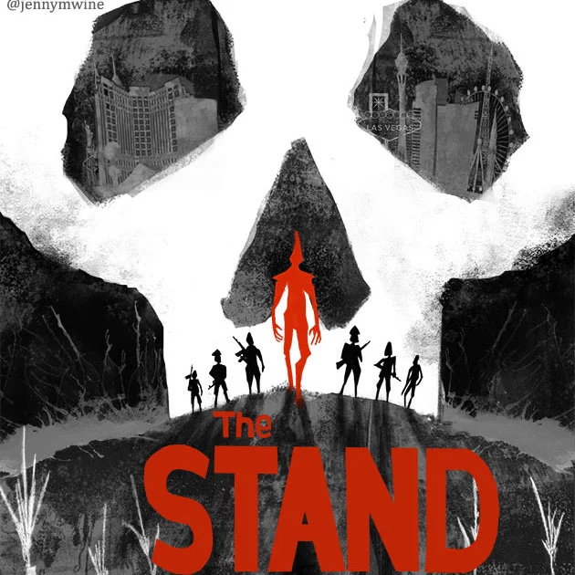
OK everybody, let’s get to it! First place goes to….Jenny Wine! She crushed the whole book cover thing with her eye-catching take on the The Stand. We would totally pick this up at the bookstore!
“OK, this is so freaking good I could probably talk about it forever. The things Jenny did right? EVERYTHING! Limited color that grabs your attention? CHECK! Skull carved out of other shapes implying a location? CHECK! Characters in strong silhouette? CHECK! Jenny gets nothing but praise from me on this one. Pro level for sure!”

1st place! Art by Jenny Wine.
Second place goes to Dima Eichhorn, for a fun and whimsical piece that captures the essence of childhood.
“For a book cover to do well it needs to have a very strong feeling to it. It needs to convey so many things at once to someone who sees it from across the bookstore. Dima's wonderful rendition of Pippi Longstocking hits all the right notes. It just has that ‘X’ factor that makes it seem just perfect for the subject matter. It's energetic and messy in the way kid's are. Nailed it!”
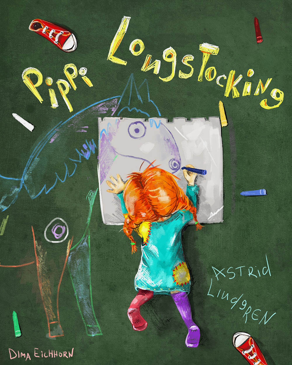
2nd Place! Art by Dima Eichhorn.
Niki Stage took 3rd place with her haunting spin on the classic childhood tale.
“Niki's wonderful version of Little Red is something you guys should really look at. By turning the shape of the forest into a menacing wolf shape, the art is doing two things at once. Jaime Zollars and I talk about this solution in the Book Cover class. It offers great economy and makes the artist look very smart! Nice type here too Niki! : )”
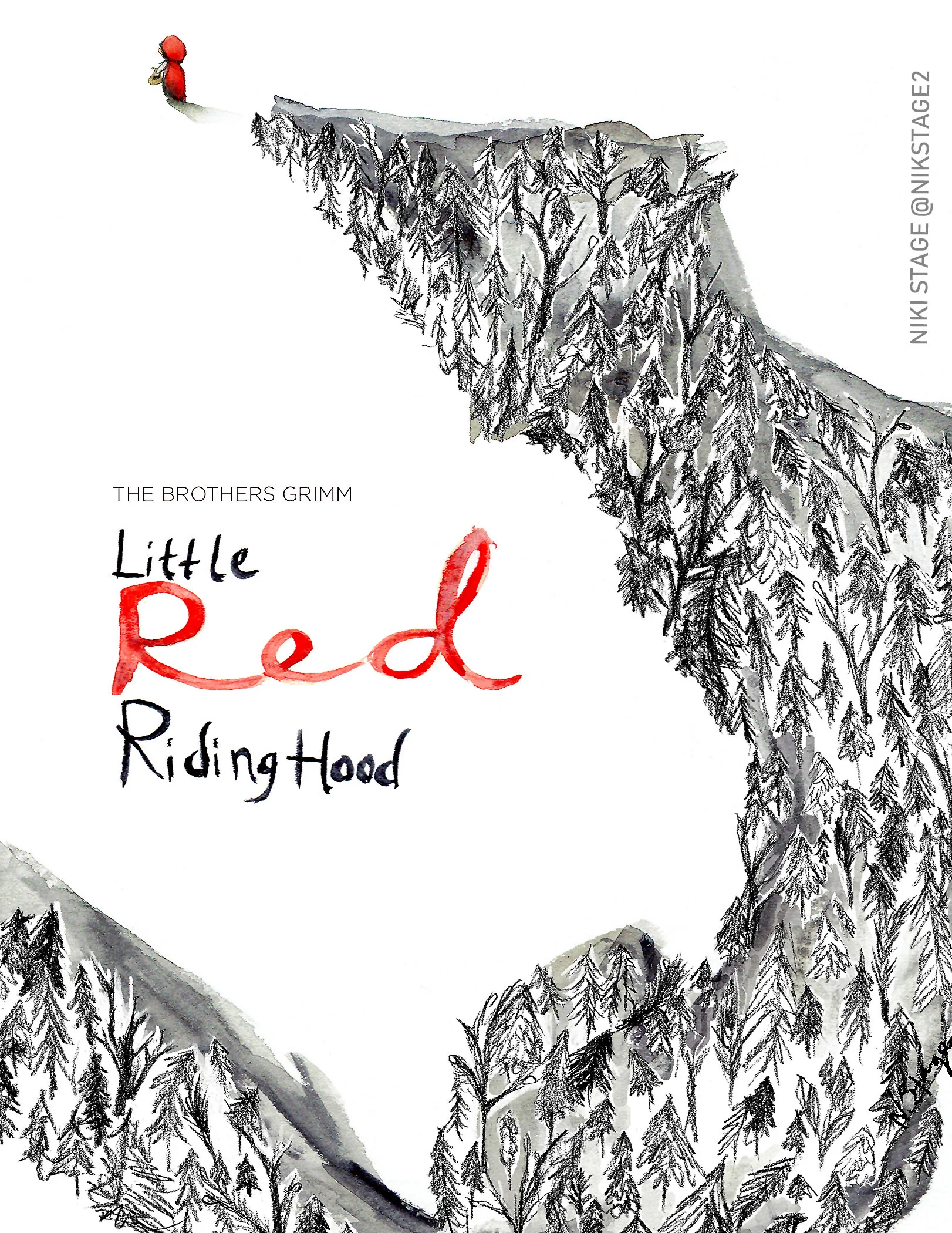
3rd Place! Art by Niki Stage.
Lee also picked 9 more illustrations as honorable mentions, check 'em out with his comments and suggestions below! If you want to see ALL the entries, check out the slideshow compiled by the excellent Chip Valecek 😎
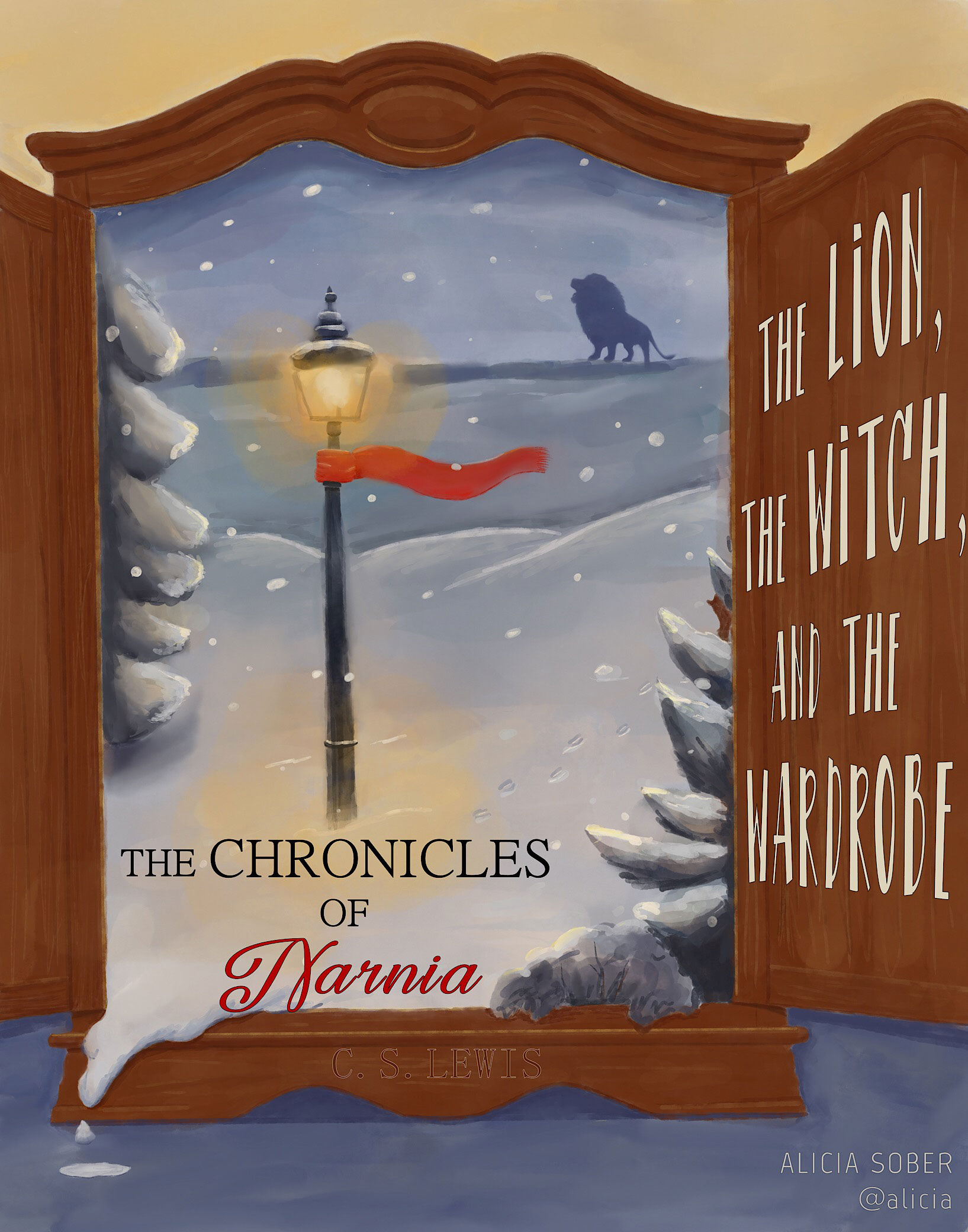
Alicia Sober
“I love seeing how Alicia played with the open wardrobe and the snow spilling out into the room. Love that! Strong shapes and nice design make this cover stand out. The type placement on the open wardrobe door might need some adjustment. That part doesn't seem to work just yet. Maybe pull back on the scene a bit and give yourself some room to work with at the top or bottom.”
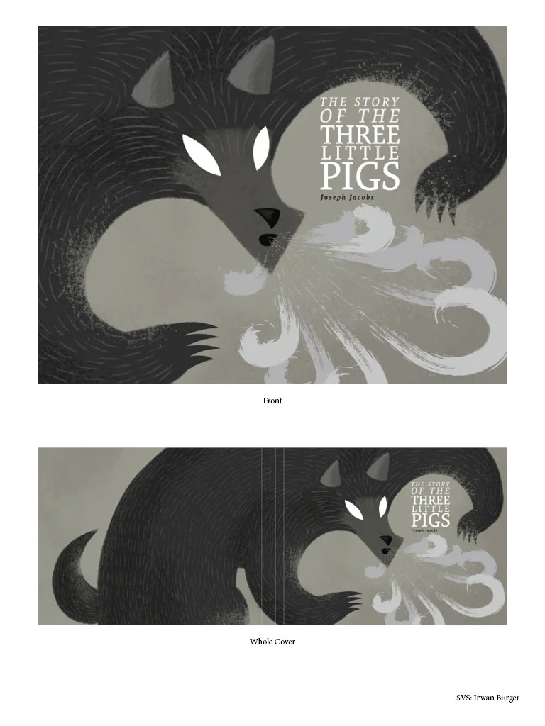
Irwan Burger
“Great design and limited palette. I think more could be done with the focal point which is where the wolf is blowing. We need a payoff there. Maybe the smoke is shaped like pigs? I think this one is close. Maybe just figure out that focal point and it will be done.”
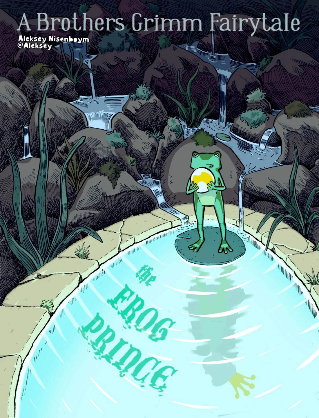
Aleksey Nisenboym
“Aleksey's cool woodcut style perfectly compliments his nice sense of design on this cover. Very nice cover from close up and would also work well from across the room. The only touch up needed is the character of the frog. It's tough to tell how we are supposed to feel about him and what he is thinking. His style seems a little different than the rest of the piece too.”

Shannon Bergin
“Shannon's Coraline cover is sweet! The choice to stay in grey scale is a good call and adds to the drama nicely. This one is working quite well as is, but maybe we can sneak some more interesting symbolism in there. Look to the negative spaces in between the fingers, etc. That is how you can take a very good cover like this and make it great.”
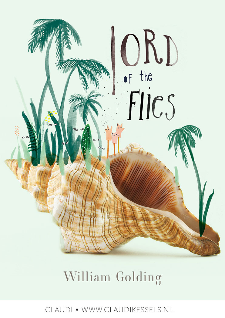
Claudi
“I really like the style of this one! Very cool! BUT, the style is also why I didn't pick it for the top 3. You may be very confused now. Let me explain. A book cover has to give the feeling of the written material. Lord of the Flies is almost a horror story. It's gritty and intense. I felt like this cover needs to hit more of that note to really sell it. But as an illustration, I love this style. It would work for many YA covers maybe better than it does for Lord of the Flies.”

Elizabeth Hoffman
“This is so good and I really love it. The only reason this one didn't win is that it didn't give me a new take on the subject matter. But it updated a classic nicely. I would definitely keep this in your portfolio. The style is modern and is being sought after by many art directors. Very appealing image!”
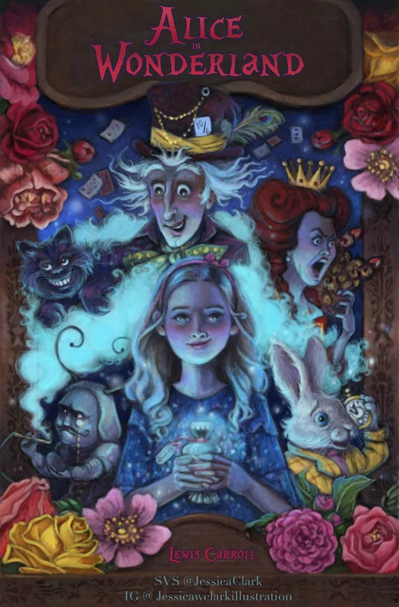
Jessica Clark
“Jessica's Alice cover is really nice! Look at all that beautifully painted imagery! Nice detail and drawing skill for sure! The only suggestion I have is try to highlight a focal point a little more. Right now everything is almost the same value which can make it seem a little muddy. Think about bringing some shapes forward and pushing others back in space. Think about what order you want the reader to notice all the things in the image.”
Jason Rodriguez
“This is just awesome and could have been in the top three. I wish I could just keep giving a bunch of 1st place finishes! I don't have any adjustments I'd make. The mark making is great and the design is very controlled with detail and value. Lovely image.”
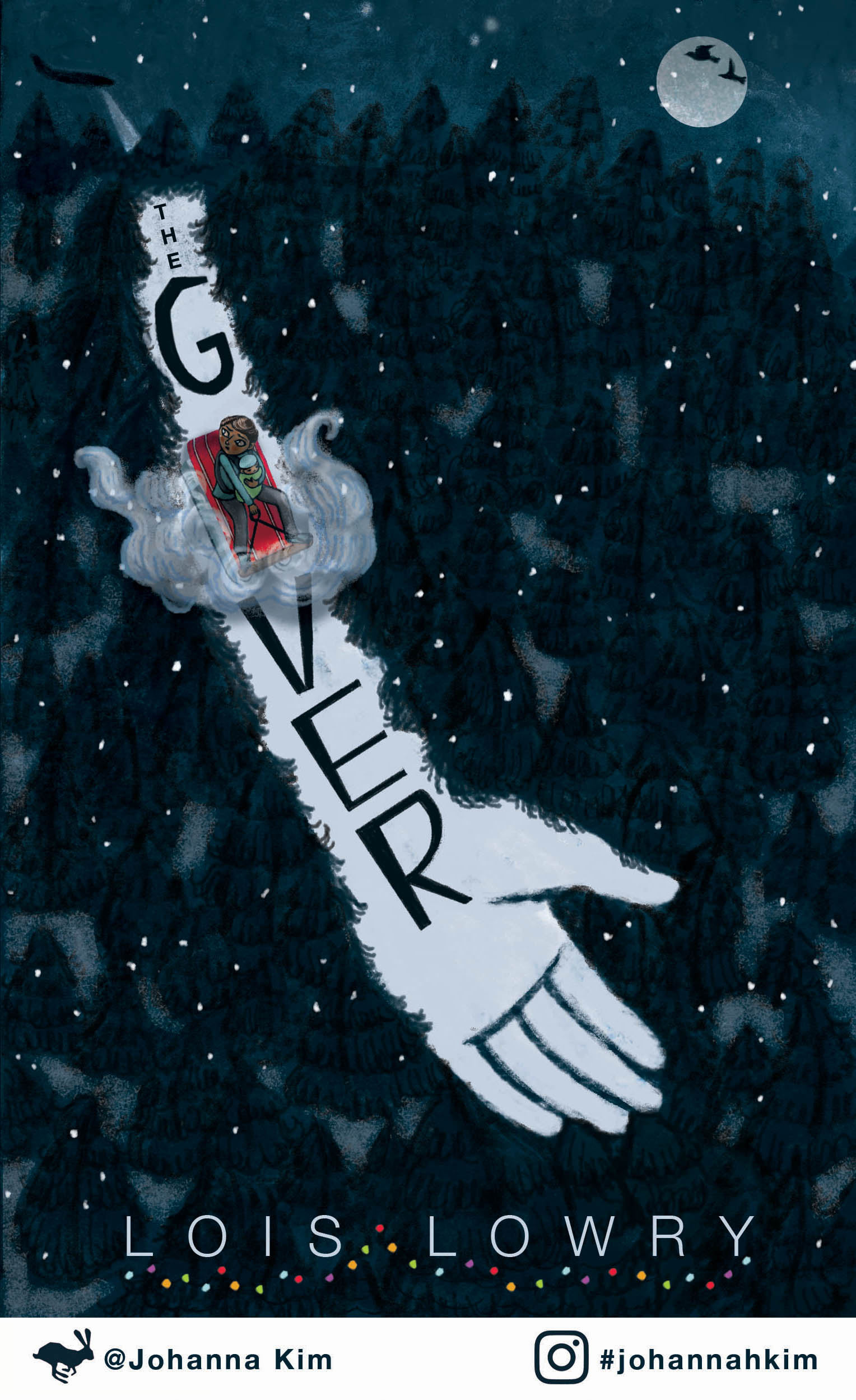
Johanna Kim
“Johanna is a pro at these contests now and has placed in every one she enters it seems. Let's go ahead and add this one to the list. Johanna is killing it and I am a big fan! The only thing here is that the character seems a little muddy in there. Is there a way to clean him up so he reads a little easier?”
Well, that’s it for now! Great work everyone👍👍👍 Thanks again to all who took part, you guys rock!