Are There Shortcuts To Making Great Art?
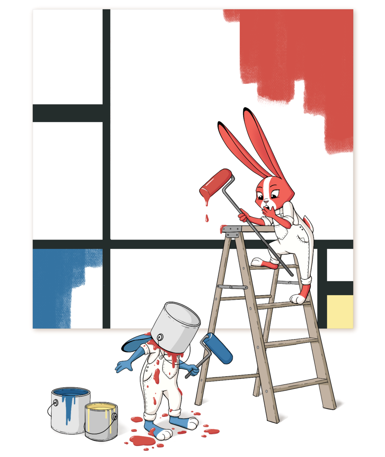
Art by Miranda Hoover
This episode was tailor-made for our Critique Arena contestants, but there are lessons applicable to most beginning illustrators here -- namely, what are the common illustration mistakes that hold your art back, and what shortcuts can you take to make great art? This week, Jake Parker, Lee White, and Will Terry do a deep dive the common pitfalls that beginning artists fall into and offer their solutions.
Note: We’ve done our best to provide relevant links to products mentioned in this podcast. SVSLearn and the 3 Point Perspective podcast are supported by qualifying purchases. Thank you for your patronage!
SHOW LINKS
INTRO
The Oreo method for critiquing: give them a compliment or something nice, then a critique, then something nice. It’s a tried and true method!
What are we talking about today? Something pretty cool! This is a podcast that we promised the participants of Critique Arena at SVSLearn.com. (Find the latest Critique Arena prompt on the SVSLearn Forums!)
CRITIQUE ARENA
Will loves Survivor. How do we do something like that in the art world? How do we get creative and be less stuffy? Let’s compete. There is a monthly illustration prompt, and everyone who wants to can make some art for it and submit their work. Then there is a 16 person bracket that gets judged and critiqued by Jake, Lee, and Will, as well as an audience vote. The top two winners get to illustrate our awesome podcast artwork.
A lot of these participants who win are getting their first paying gig, and get to work with Jake as an art director.
We have had a lot of the same people in the top 16 and it’s always fun to see someone new enter the bracket and knock someone else out. It’s a lot of fun if you like competition.
This podcast episode is a strategy session for people who want to enter the competition, as well as people who want to make great art in general.
COMMON PITFALLS
A lot of students use the soft-edge brush in Photoshop, without controlling the edges. The whole thing ends up blurry. Edge control is really important. Soft brushes can be useful in the background. But the foreground should be crisp, and the background should be softer. It’s unappealing to look at soft edges.
Make a new layer in Photoshop, and fill a square with a solid color. If that looks unusually crisp on your image, then your image is likely way too soft. There should be parts that are sharp, crisp, firm, and lost. Lee has a lot of blurry edges in his work, but he uses sharp edges to draw the eye of the viewer, and makes sure there is at least some sharpness in all of his work.
Make sure your image is finished! Every month we get a few that don’t look finished, or just petered out near the end. If it looks more like a study than a finished piece, it is hard to pick. Make it look as polished as you can. Some illustrators are really loose but their work looks finished. The unfinished/finished look is done by people with lots of experience in finishing work. It’s best to finish a lot of work and then develop the barometer from experience, how much sketchiness you can leave in.
Where do you want them to look? That is where you should put your finish. Put the tighter detail in the parts where you want your viewer to see.
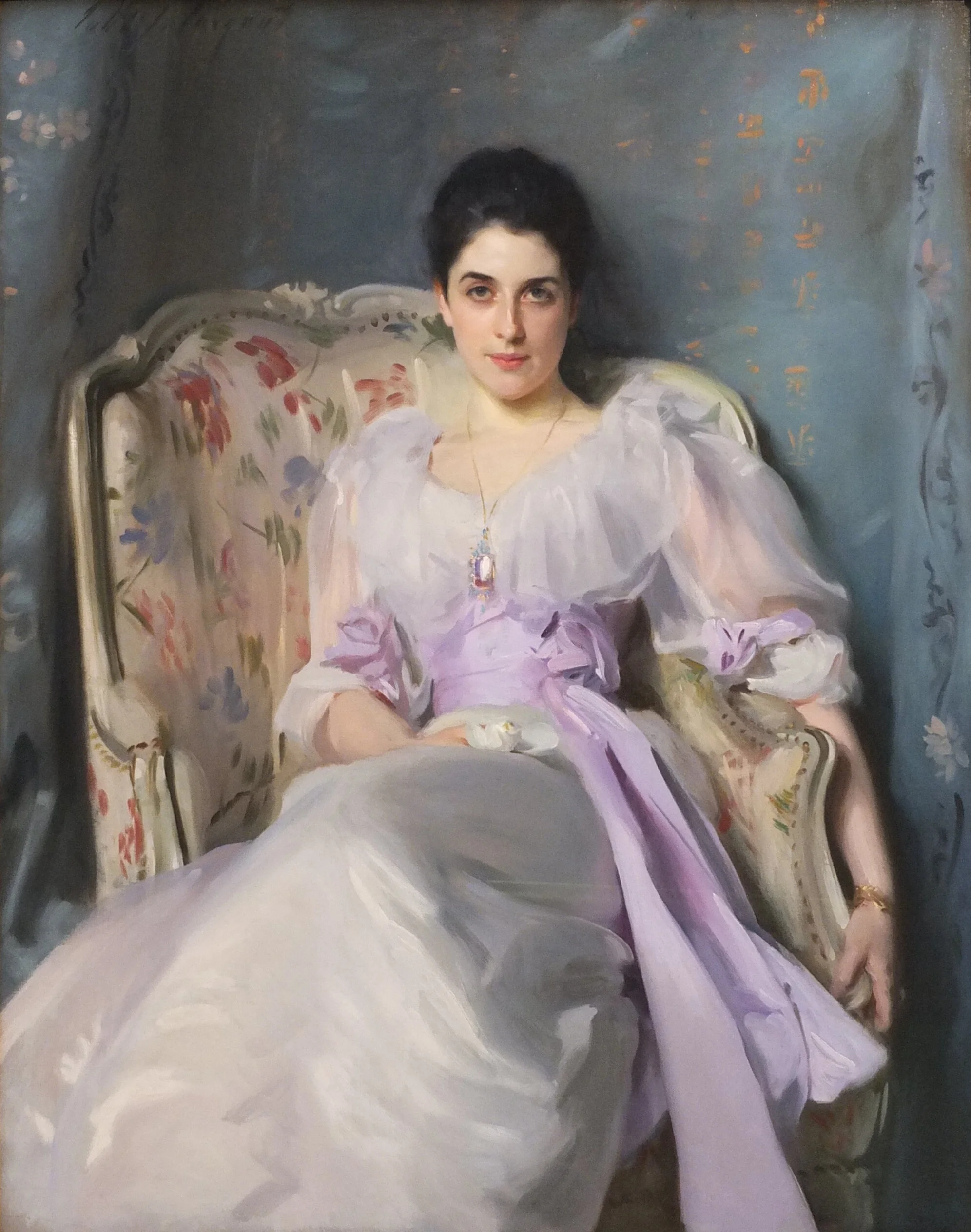
Lady Agnew of Lochnaw by John Singer Sargent
When Will sees art, he wants to be moved by it -- some sort of emotional impact. Half of them look very nice but have no story elements, and don’t say anything. We like decorative work, but not for children’s books. Our focus is on narrative art, so it’s important to include a narrative element and make the story concept strong.
Illustration is like a gag in some ways -- there needs to be a punchline, or a provocative element, or something that is a payoff in the image. Make your audience feel something!
Step one would be just having the idea, and then turning it in. The second step would be adding story elements -- where are they going, what are they doing, where are they coming from? Consider adding a verb to the word prompt, and show what they are doing or have done. Let the audience make up part of the story in their mind.
Will would pitch the idea to his wife to see if she liked it. Pitching and verbalizing your idea can help a lot to troubleshoot story problems. The more you pitch, the more streamlined your story becomes.
Sometimes the problem is clarity -- the characters are doing something great, but we don’t really understand what’s happening. Good technique can push it over the edge.
Show a thumbnail to someone without telling them what it is, and see if they understand what is going on. Clarity is key! You want a quick read.
SHORTCUTS TO SUCCESS
It looks like at least a third of entries are not looking at great illustrations. Go on our forums and look at all of the winning entries, and compare it to your own work and see if it holds up. Or set your bar even higher and it will push you to level up faster.
Do master copies of great work. They are a great way to learn and develop as an artist. Jake will do work in the style of a master these days, rather than a straight ahead master copy. Don’t be afraid of looking at how other artists work, because you can learn a lot from other artists while still maintaining your own style. Every artist’s style is an amalgamation of their influences.
Take classes. Hearing something a bunch of times will eventually make it click in your mind. One day you will just get it, after being exposed to it a lot.
There needs to be a storytelling element if you want to do narrative art. There is a lot of great work out there for non narrative artists, but if you want to do children’s books, you need to have a good basis in narrative art.
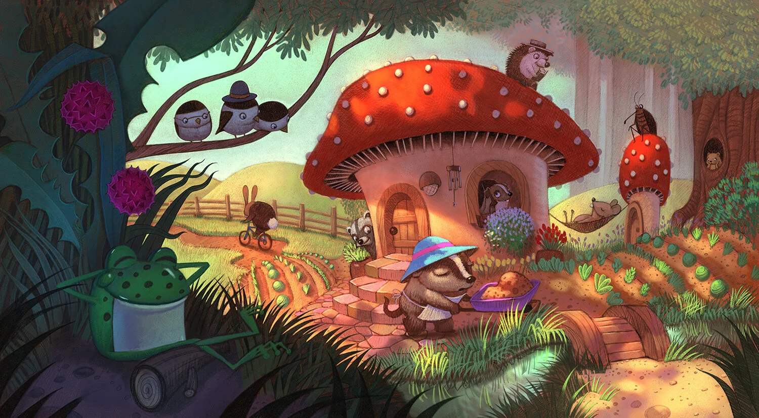
Will’s illustration of the muskrats in the toadstool.
We also need more innovation! Look at how other illustrators solve problems and formulate opinions and theories in your work. You need a good basis and foundation before you start experimenting a lot.
Simplify. They would see fun ideas with good rendering, but it would be too complicated and poorly designed. Jake’s formula for a simple image: break down the image into 3 planes. The foreground, the middle ground, and the background. Of those 3 planes, you can make different levels of complexity but they need to read as foreground, middle and background. Make your foreground simple, middleground complex, and background simple. Decide which plane you want all the action to take place on.
Lee’s formula is that you get 8 major shapes in a piece, because it forces you combine all your elements into specific shapes. If there are too many shapes, you should start getting rid of things. Make sure your negative space also is taken into account.
LINKS
Jake Parker: mrjakeparker.com. Instagram: @jakeparker, Youtube: JakeParker44
Will Terry: willterry.com. Instagram: @willterryart, Youtube: WillTerryArt
Lee White: leewhiteillustration.com. Instagram: @leewhiteillo
Daniel Tu: danieltu.co.
If you like this episode, please share it, subscribe, and let us know your thoughts or if you learned something new!
If you want to be a part of the discussion and have your voice heard, join us at forum.svslearn.com.